

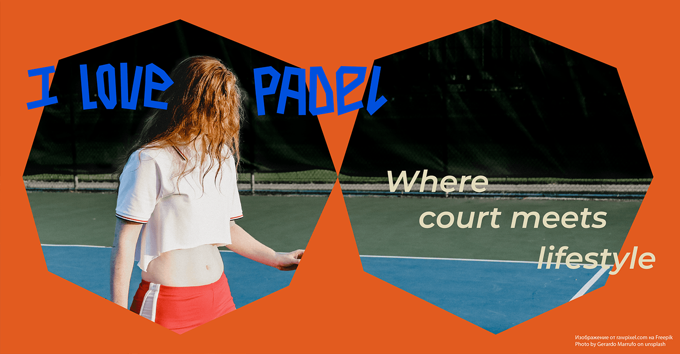
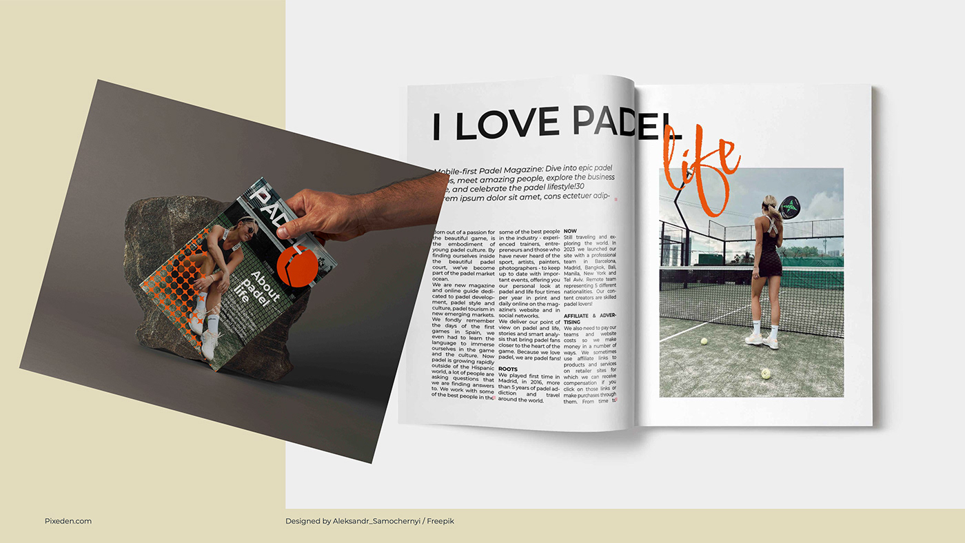
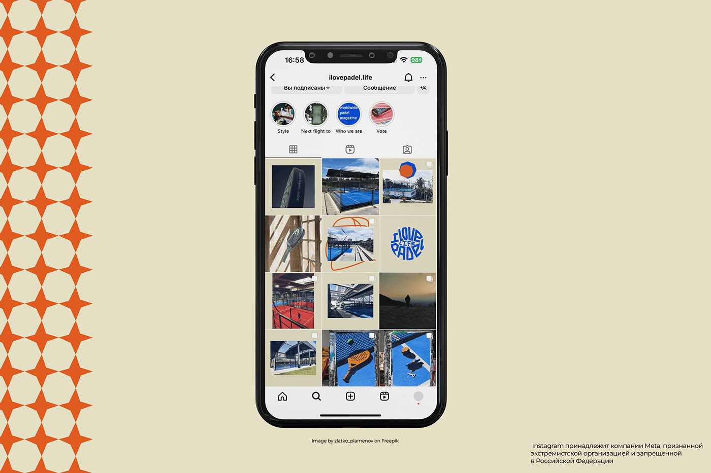
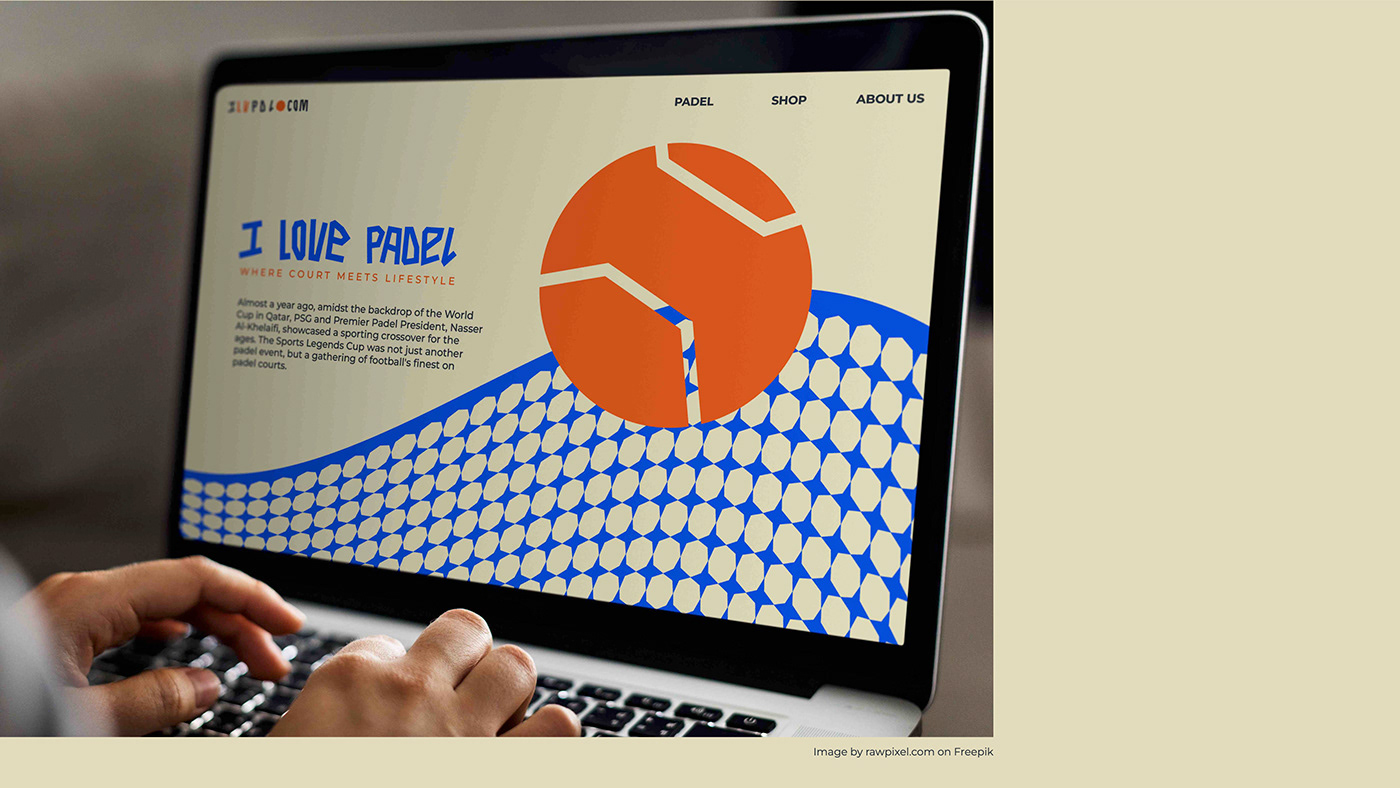
ILOVEPADEL.life – это новое международное медиа: сайт, соцсети, печатный журнал и онлайн-магазин для людей, играющих в падел и любящих его всем сердцем.
Падел – игра, похожая на теннис и сквош. Но играют в нее «два на два», а корт обязательно огорожен по всему периметру.
Падел очень востребован в Латинской Америке и стремительно набирает популярность во всем остальном мире.
Это зрелищная и динамичная игра: участникам необходимо уметь быстро передвигаться, вырабатывая мгновенную реакцию. А ещё это очень социальный вид спорта – недаром игроки в падел образуют большие и крепкие комьюнити.
ILOVEPADEL. life - is a new international media: a website, social networks, a print magazine and an online store for people who play padel and love it with all their hearts.
Padel is a game similar to tennis and squash. But they play it "two on two", and the court is necessarily fenced around the perimeter.
Padel is in high demand in Latin America and is rapidly gaining popularity throughout the rest of the world.
This is a spectacular and dynamic game. participants need to be able to move quickly, developing an instant reaction. And it's also a very social sport - padel players form large and strong communities.
Искренняя любовь к паделу сподвигла основателей ILOVEPADEL.life еще больше объединить единомышленников вокруг всего, что связано с этим видом спорта. Вместе с этим появилась необходимость в создании уникальной айдентики, отражающей ценности и миссию проекта.
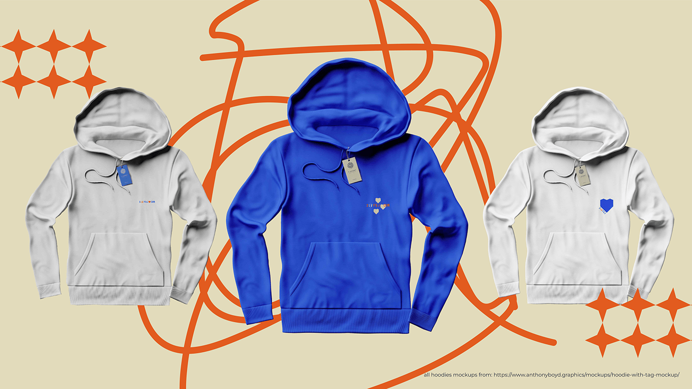
Мы выбрали два максимально контрастных цвета: неоновый синий и приглушенный, но заметный оранжевый. Эта палитра помогла раскрыть и усилить динамичный характер игры.
Также были выбраны два дополнительных нейтральных цвета.
The sincere love for padel inspired the founders of ILOVEPADEL.life to further unite like-minded people around everything related to this sport. At the same time, there was a need to create a unique identity reflecting the values and mission of the project.
We chose two contrasting colors as much as possible: neon blue and a muted but noticeable orange. This palette helped to reveal and enhance the dynamic nature of the game.
Two additional neutral colors were also selected.

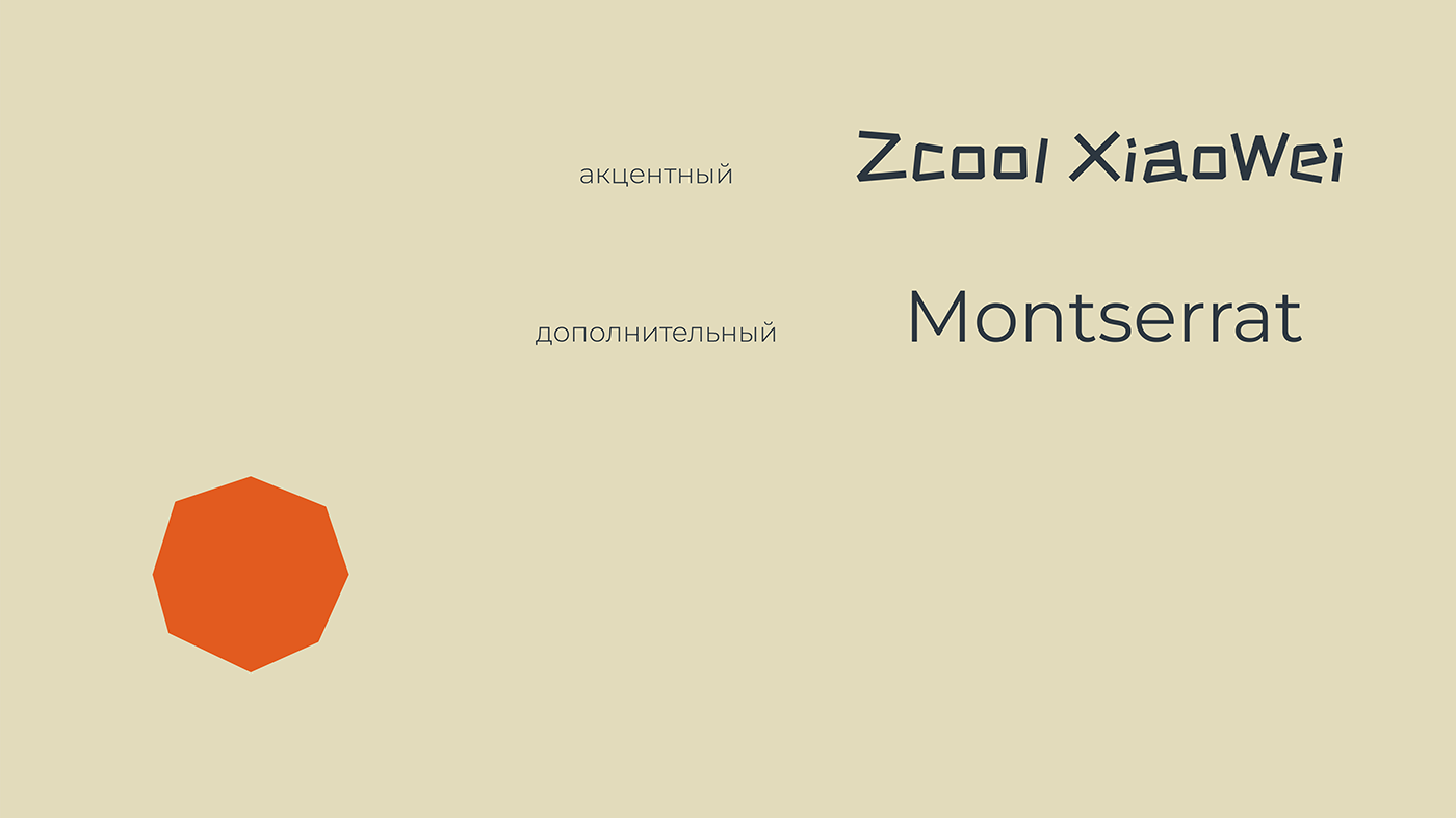
Изначально у ILOVEPADEL.life уже были выбраны шрифты:
Акцентный ZCOOL Kuala – яркий и насыщенный шрифт с ярко выраженным характером.
Дополнительный Montserrat – прекрасный минималистичный шрифт с девятью начертаниями и широкими пропорциями.
Initially, ILOVEPADEL.life had already selected fonts:
Accent ZCOOL Kuala is a bright and saturated font with a pronounced character.
Accent ZCOOL Kuala is a bright and saturated font with a pronounced character.
The additional Montserrat is a beautiful minimalistic font with nine fonts and wide proportions.
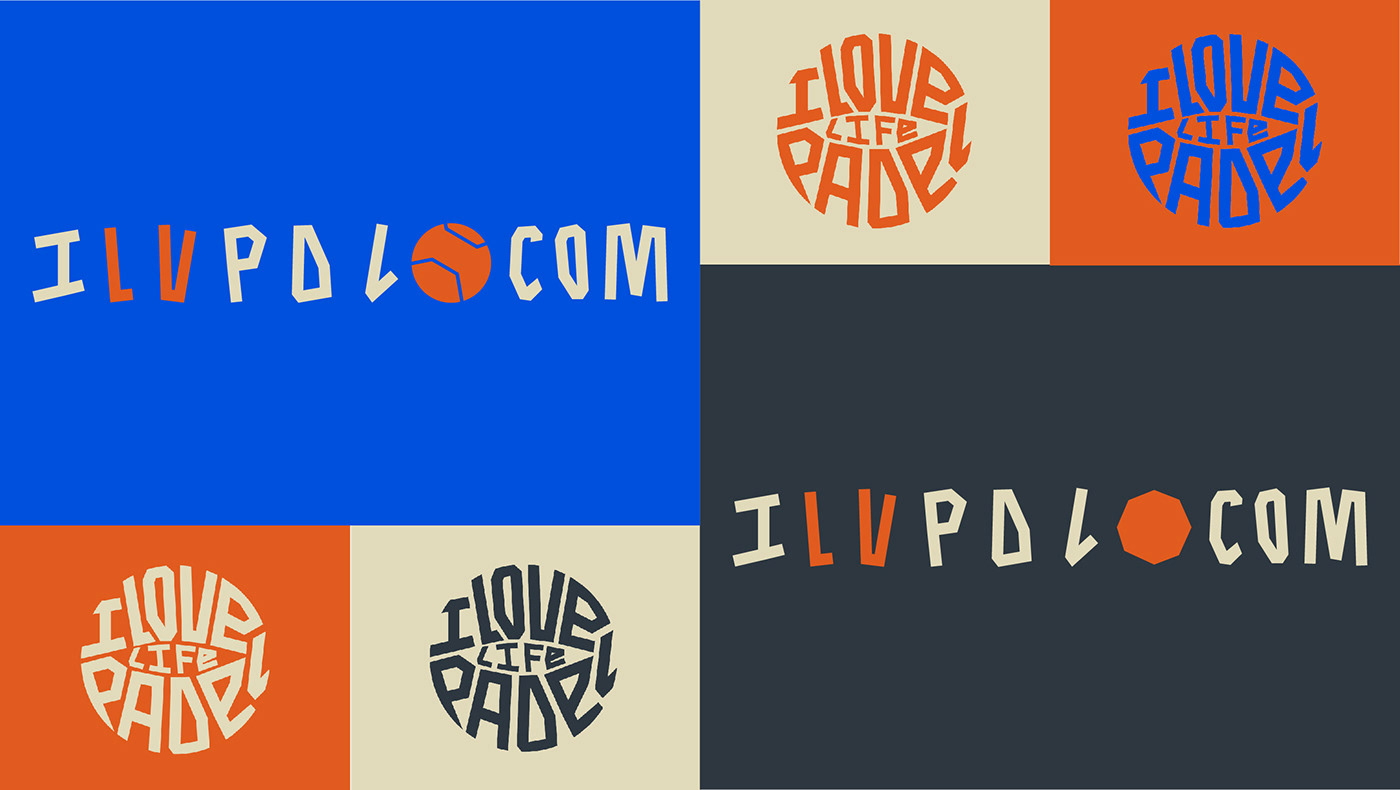
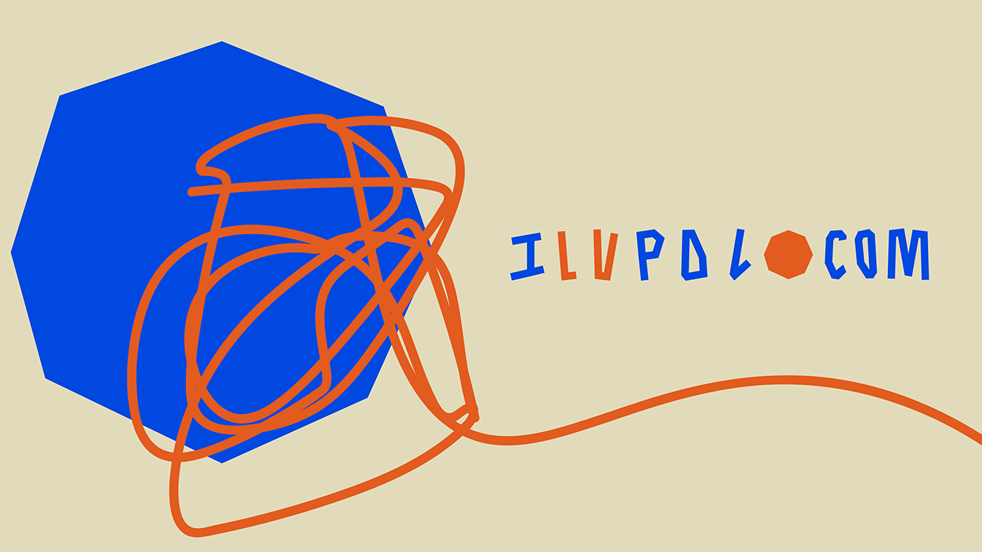
Также для бренда уже были созданы логотипы, которые мы дополнили альтернативными вариантами с аббревиатурой ILVPDL на основе акцентного шрифта.
Also, logos have already been created for the brand, which we have supplemented with alternative variants with the abbreviation ILVPDL based on the accent font.
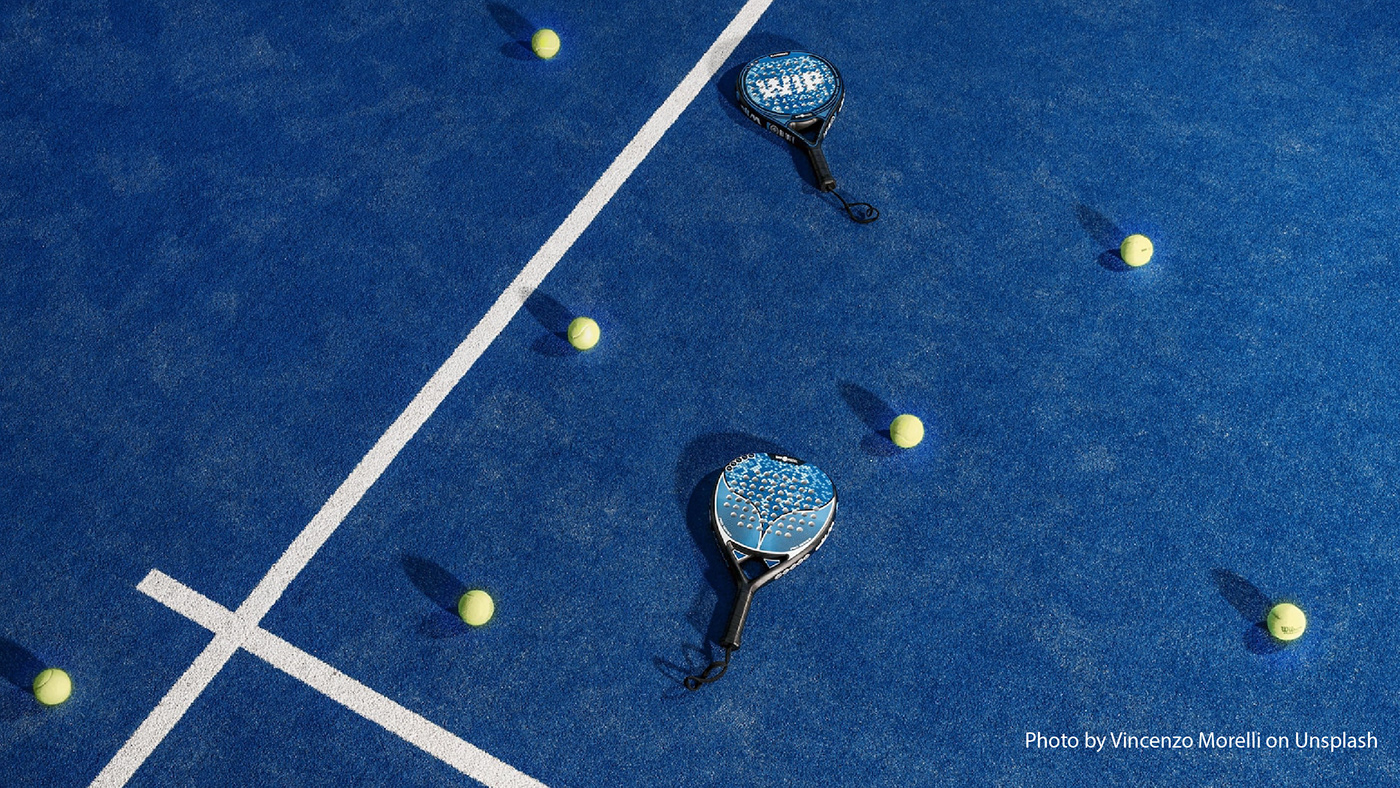
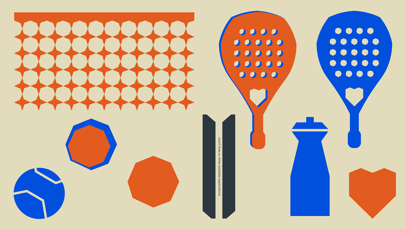
С первого взгляда падел очень похож на теннис. Помимо отличительных правил и корта есть один явно выделяющийся атрибут – ракетка, которая вместо сетки имеет дырки.
Поэтому основой для айдентики стало слияние геометрической фигуры круга и акцентного шрифта ZCOOL Kuala Regular – многоугольник, напоминающий отверстие в ракетке.
Далее мы развили этот элемент и разработали другие дополнительные: ракетка, мяч, сетка и линии корта, бутылка для воды и, конечно, сердце как символ любви к паделу.
At first glance, padel is very similar to tennis. In addition to the distinctive rules and the court, there is one clearly distinguished attribute - a racket that has holes instead of a net.
Therefore, the basis for the identity was the fusion of the geometric shape of the circle and the accent font ZCOOL Kuala Regular - a polygon resembling a hole in a racket.
Next, we developed this element and developed other additional ones:
a racket, a ball, a net and court lines, a water bottle and, of course, a heart as a symbol of love for padel.


Также у нас появились хаотичные элементы из линий и серия паттернов, призванные усилить характер бренда и разнообразить собой соцсети, постеры и открытки.
В итоге получилась трендовая, яркая, живая и игривая айдентика – такая же, как и сам падел!
We also have chaotic line elements and a series of patterns designed to enhance the character of the brand and diversify social networks, posters and postcards.
The result is a trending, bright, lively and playful identity - the same as Padel himself!


Команда:
Светлана Стрелкова – графический дизайнер
Илья Техликиди – арт-директор и креативный продюсер
Максим Сырейщиков – основатель проекта
Team:
Svetlana Strelkova - graphic designer
Ilya Tehlikidi - art Director and creative producer
Maxim Syreyshchikov is the founder of the projects
Svetlana Strelkova - graphic designer
Ilya Tehlikidi - art Director and creative producer
Maxim Syreyshchikov is the founder of the projects
Thank you for your attention!
Please, mail to
strelksveta@yandex.ru
and love padel on ilovepadel.life


